iOS 7 UI is fucking terrible
Apple,
iOS
Tab Bar

While the new color scheme here may be a matter of taste (it's not to my taste for sure), the rest is just terrible. The icons are hard to recognize thanks to thin strokes in dark gray on a bright gray background. The bold text did increase readability on small fonts and should not have been dropped. Update: This has since been changed, for the betterment of all mankind. In addition, with the frame around the active tab, the iOS 6 version made it clear which tab is active even when there are only two - something iOS 7 fails at, unless you can remember that red = active tab.
In fact, even Google Plus' increasingly horrible UI redesigns didn't manage to botch this quite as badly (in case the awful gray-on-gray looked familiar, here's why):

And just look at the new scope bar:

Urrrrgh.
Bar Buttons

Those frames around the buttons? They were there for a reason! Some part of our monkey brains is incredibly good at recognizing shapes, probably because we had to make split second decisions between running away from that sabertooth tiger or chucking a spear at the rabbit. Which is why we like icons and the more distinct the shape, the faster we can guide our fingers to the one we were thinking of.
In post-sabertooth times, we have also learnt to look for interactable elements. You never had to search for the steering wheel in a car, did you? Or where to push on your microwave oven to open the door. And that wasn't because they were painted in light blue or had written words on them. All this has gone missing with iOS 7 and you now have to remember that blue = interactable.
Popover (iPad)

This just looks terribly cluttered and overloaded. Since everything is gray, the concept of "graying out" inactive parts doesn't work anymore, as it's hard to recognize one shade of gray from another. Then there's no visible frame, and the drop shadow was dropped too. So there's no visual distinction from the popover and the stuff all around it, making it hard to tell where things start and end. Reminds me of an early helldesk job where someone couldn't grasp the concept of a windowed UI and when asked for the error message simply read everything from the top left corner until exclaiming: "I can't see what it says next because something is drawn over it".
But wait, did you spot it? Yes, here the interactable parts are red, not blue. Not a clue why.
Date Picker

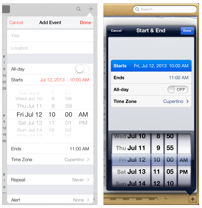
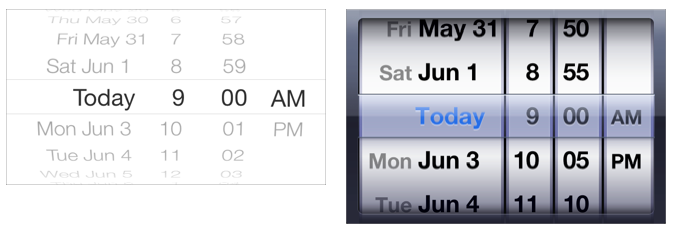
Another example of getting it all wrong. There's now a fancy 3D effect for the date picker, which squishes the text to make it harder to read (further assisted by more gray-on-gray). The useful separation of the "wheels" is gone, making it harder to tell which sections could be scrolled separately.
Progress View

Where is.. oh. A progress bar that you can't see unless it happens to be moving.
It's not all bad — or is it?

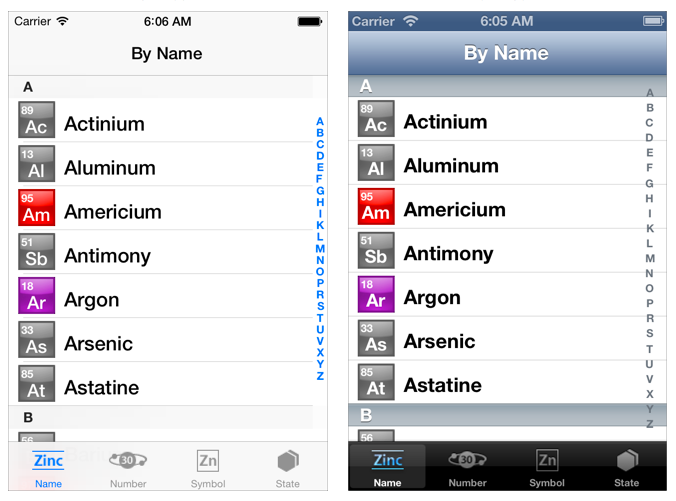
Let's take a look at the whole thing. The status bar now looks like part of the app, even though it isn't. The change from a bold to a regular font for the main list is the one good thing here - the all-bold was unnecessary and cost you the ability to use bold for emphasis. No idea why the vertical space for the A-Z register was shrunk, it was already fiddly enough to hit the right letter before. If anything, a OS X Dock zoom drag effect should've been added here. Most of the other horrors depicted here I've already covered above, but the whole picture just highlights how faded and contrast-less the whole thing looks now.
I'm kinda okay with the new switch and only a little worried about the shorter drag distance:

Conclusion
Overall this redesign seems to pick some of the worst UI mistakes from Google's web apps. It looks like the mission here was to "make it look totally new" and in the process a lot of good work was thrown out. This may eventually get accepted by existing iOS users due to lack of choice. But it won't be popular and it's bad for people that have never used a smartphone before. I wouldn't be surprised if this change lowers iOS adaption rates for first time users (i.e. young people). And it annoys people like me, who used to admire Apple because they thought long and hard about every single pixel and created the Human Interface Guidelines to improve everyones UI experience. Only to now stomp them into the dirt. Dropping the faux leather textures is all good and fine, but this needs work.
More (not from me): http://uxcritique.tumblr.com/